LEKKA / Project Eaden
Building the Category Brand for the Future of Food
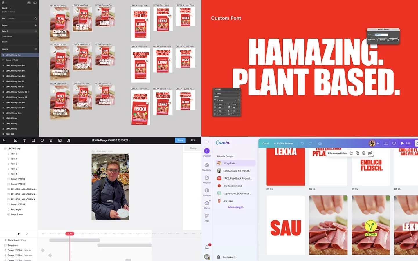
Our Approach
We started by defining LEKKA’s role in the category. Instead of focusing on what the product replaces, we focused on what it stands for. Pleasure, clarity, and everyday relevance. From there, we developed a strong strategic foundation that guided every creative decision.
Naming conventions, tone of voice, visual language, and packaging were all designed to work together as one coherent system. Key to the process was designing for real world use. Supermarket shelves, quick decisions, and repeat purchases. Every element had to be instantly recognizable and emotionally resonant.
What we did
- Brand strategy and positioning
- Visual identity and design system
- Packaging design across the product range
- Tone of voice and brand messaging
- Digital applications and launch assets
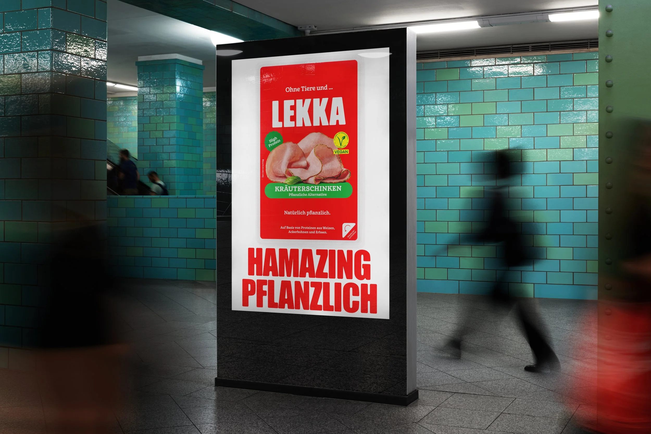
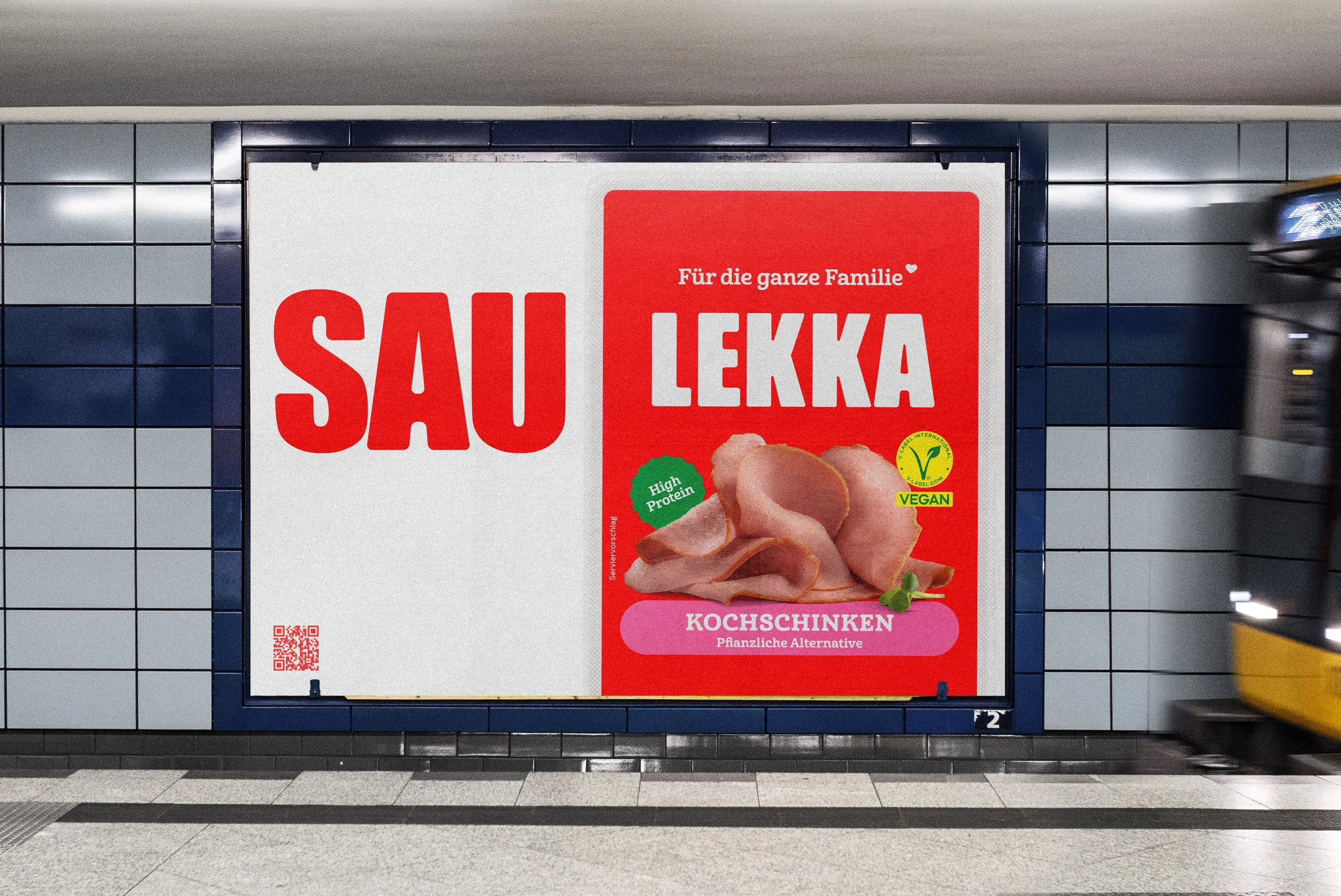
The Result
LEKKA launched with a bold, confident identity that clearly separates it from conventional food branding. The new look is simple, distinctive, and highly scalable. On shelf, LEKKA stands out through clarity rather than noise. Online, the brand feels consistent, contemporary, and ownable.
Most importantly, the brand now communicates what LEKKA really is. Not an alternative, but a modern food brand built for everyday life.
Impact
- Strong shelf presence with high recognition
- Strong Go-To-Market across all touchpoints
- A flexible system implemented for new products and markets (DACH/GSA)
New Business?